Bad ads

- I would change the background, it is competing with the focal point
- I would also change either the bubble color or the background, green and blue do not create good contrast
- The text is almost not readable.

- Adjust alignment, too many are centered.
- Lack of pattern or Repetition, a lot of the services can have repeated format
- Too many font types

- Bad photoshop edits on the lawn and the hand
- I would change the texts on the middle section (green background) to white
- all texts do not have to be all centered
Good Ads

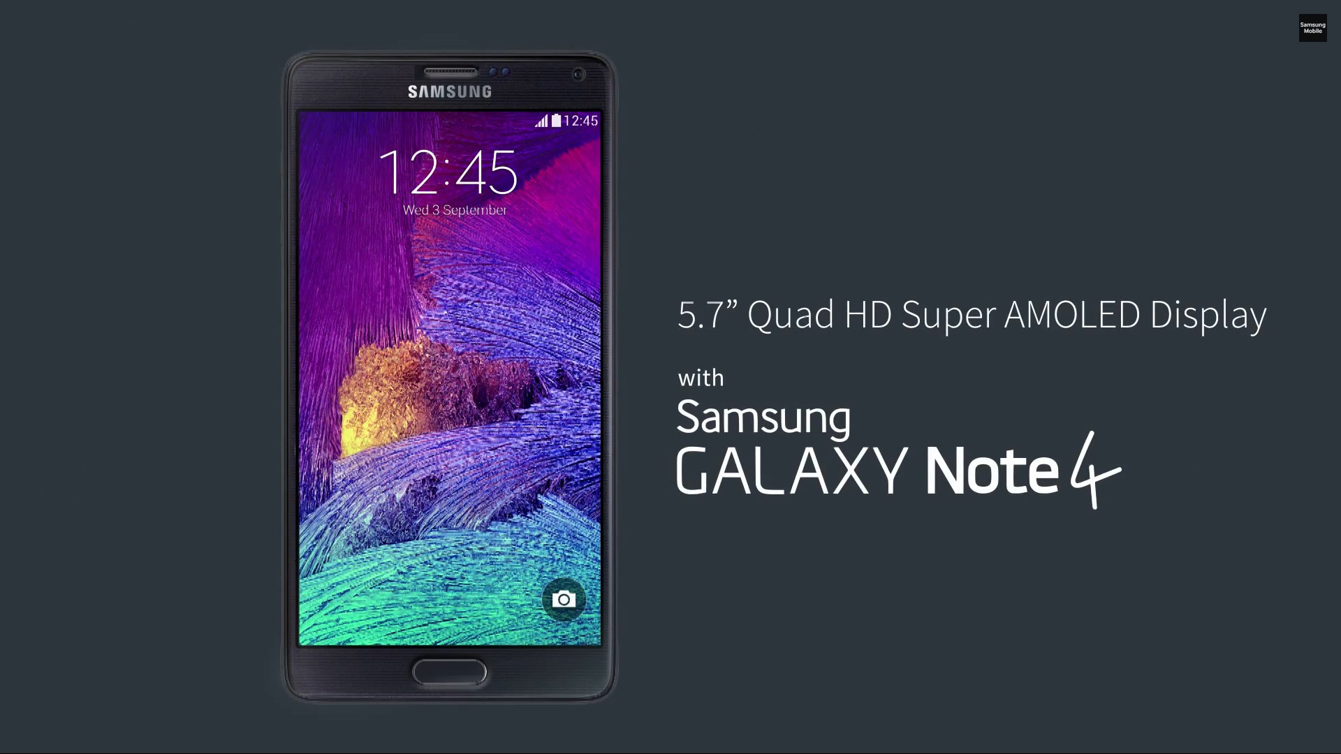
The great contrast makes the focal point of the ad very visible.

The simple subtle background-color makes the main object and texts easy to see and read
 I love how this ad uses type and font settings to deliver the important message
